Project planning guide
Before you build
Use the reference image and planning notes as a starting point. Confirm dimensions, loads, materials, local codes, and site conditions before purchasing or cutting.
- Kitchen Design
- 8 reference images
- Print-friendly guide
Kitchen cabinet colors in 2026 are moving warmer and more natural, but the best palette is still the one that works with your fixed surfaces and daylight. Current U.S. renovation data places wood slightly ahead of white, while industry experts continue to favor neutrals, greens, and blues. Use those signals for inspiration—not as a reason to ignore your room.
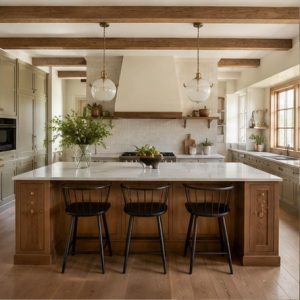
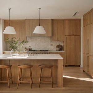
Natural white oak
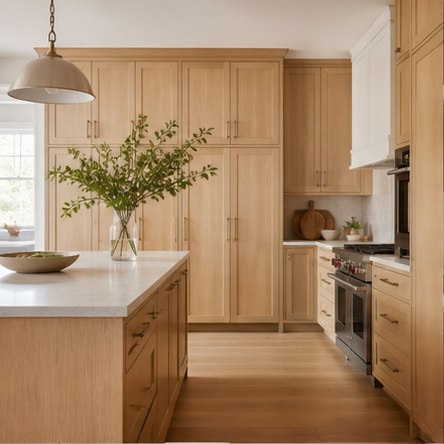
White oak brings quiet pattern and warmth without reading as dark. Specify the cut, grade, veneer sequence, stain, and sheen because the words “white oak” cover a wide range of looks. Pair it with calm counters and let the grain carry the visual interest. A sample door is far more reliable than a small chip.
Medium walnut
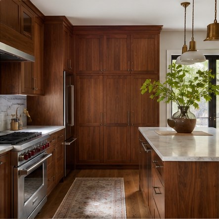
Walnut creates a richer, furniture-like room and looks especially balanced with pale stone and controlled lighting. Use continuous grain where it matters and avoid mixing too many unrelated brown woods nearby. In a compact or low-light kitchen, walnut may work best on the island or one tall wall rather than every elevation.
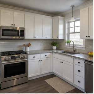
Warm off-white
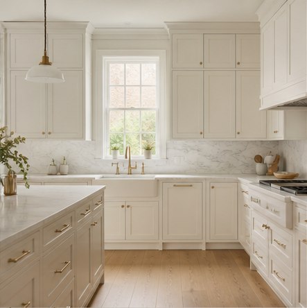
Warm white remains a flexible choice when it shares undertones with the counter and wall color. Compare samples against the brightest white object in the room; a cabinet can look creamy alone and unexpectedly gray or yellow beside another finish. Slight contrast is usually more forgiving than trying to match several white products exactly.
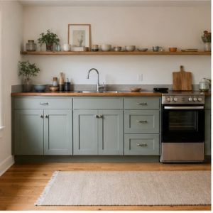
Olive green
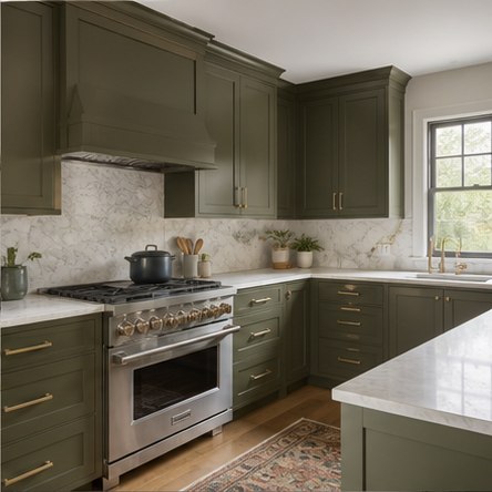
Olive behaves almost like a neutral when it is muted and grounded. It pairs naturally with wood, unlacquered or brushed metals, and warm white stone. Evaluate it in shadow as well as daylight—a color that feels sophisticated on a sample may become nearly black beneath upper cabinets without good task lighting.
Muted blue
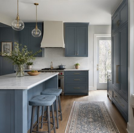
Dusty blue adds identity while remaining easier to live with than a very saturated color. Repeat it selectively in fabric, art, or a nearby room rather than matching every accessory. Blue can turn cool under high-color-temperature lamps, so confirm the final lighting before approving the paint formula.
Mushroom taupe
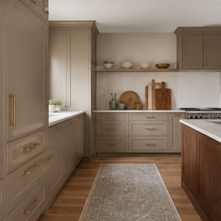
Mushroom and putty tones bridge warm and cool materials, making them useful with mixed stone, stainless appliances, and wood floors. Their undertones are sensitive to surrounding color. Move a large painted sample around the room and view it upright; a horizontal chip on a table will reflect light differently than a cabinet door.
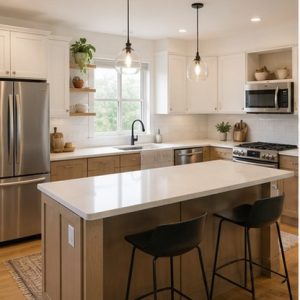
Two-tone wood and white
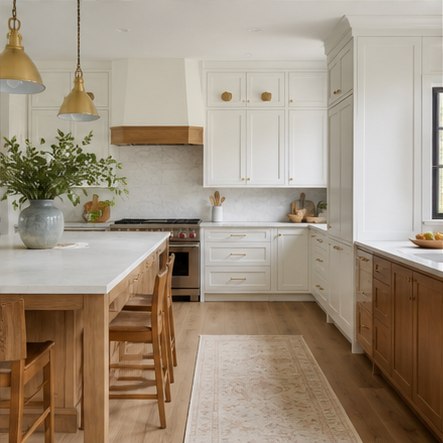
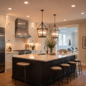
A two-tone scheme can clarify the architecture: light perimeter cabinets recede while a wood island anchors the center. Keep door style, hardware, or countertop details consistent so the change feels intentional. In a small room, limiting the darker finish to the base or island preserves brightness at eye level.
Deep charcoal
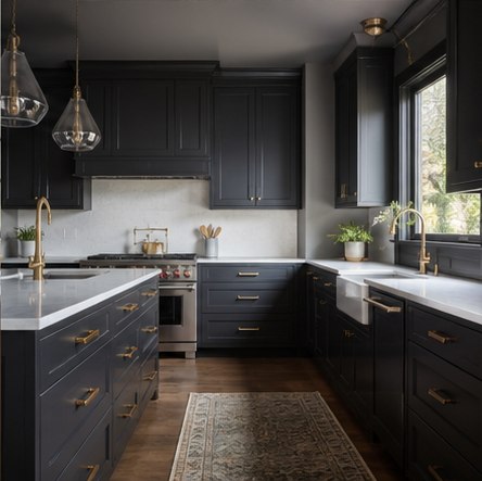
Charcoal gives a kitchen depth without the strong color identity of green or blue. It works best with abundant light, reflective counters, and deliberate task lighting. Choose a washable cabinet finish and expect dust, fingerprints, and edge wear to be more visible on very dark, low-sheen surfaces.
Planning checklist
- Collect samples of every fixed surface before choosing paint or stain.
- Order a full-size sample door in the actual sheen.
- View samples upright in morning, afternoon, and electric light.
- Check how the color changes beneath upper cabinets and inside corners.
- Approve hardware, wall paint, and lighting temperature as one palette.
Planning dimensions and product guidance are general. Verify the selected appliance and material instructions, site conditions, accessibility needs, and applicable local codes with qualified professionals.
Frequently asked questions
What is the most popular kitchen cabinet color in 2026?
Houzz’s U.S. renovation study places wood first at 29% and white close behind at 28%. Popularity is useful context, but your fixed finishes and light should drive the final choice.
What cabinet colors are most timeless?
Natural wood, warm white, and quiet mid-tone neutrals tend to adapt well. Timelessness also depends on a simple door profile, durable finish, and a palette that belongs with the house.
Should upper and lower cabinets be different colors?
They can be. A darker base with lighter uppers often grounds the room while preserving brightness. Repeat at least one material or detail to connect the two finishes.