Project planning guide
Before you build
Use the reference image and planning notes as a starting point. Confirm dimensions, loads, materials, local codes, and site conditions before purchasing or cutting.
- Kitchen Design
- 8 reference images
- Print-friendly guide
Outdoor colors are read beside house siding, paving, plants, sky, stainless appliances, and changing daylight. A palette that looks calm on a small sample can glare in full sun or disappear in deep shade, so the most reliable approach is to coordinate a few exterior-rated materials and test them at the site.
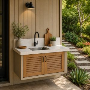
Warm White and Natural Wood
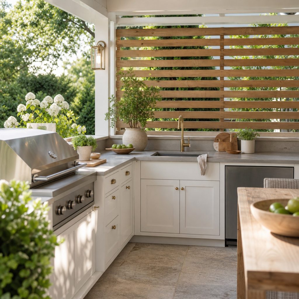
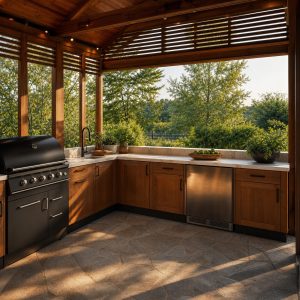
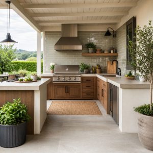
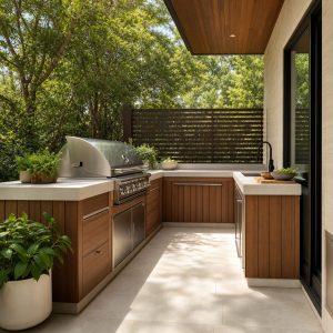
Warm white keeps a covered kitchen bright while wood tones connect it to the garden. Choose exterior-rated finishes and keep combustible wood outside appliance clearances. A slightly creamy white usually relates more comfortably to warm paving than a sharp blue-white.
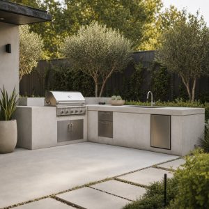
Charcoal, Gray Stone, and Timber
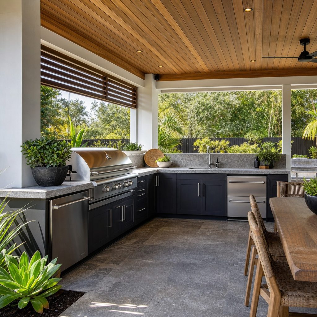
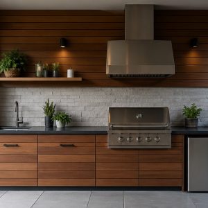
Charcoal helps stainless appliances recede and suits modern architecture. Dark surfaces absorb heat and show dust or water spots differently, so test them in full sun. Timber above or beside the room can keep the palette from feeling severe.
Muted Sage and Cream
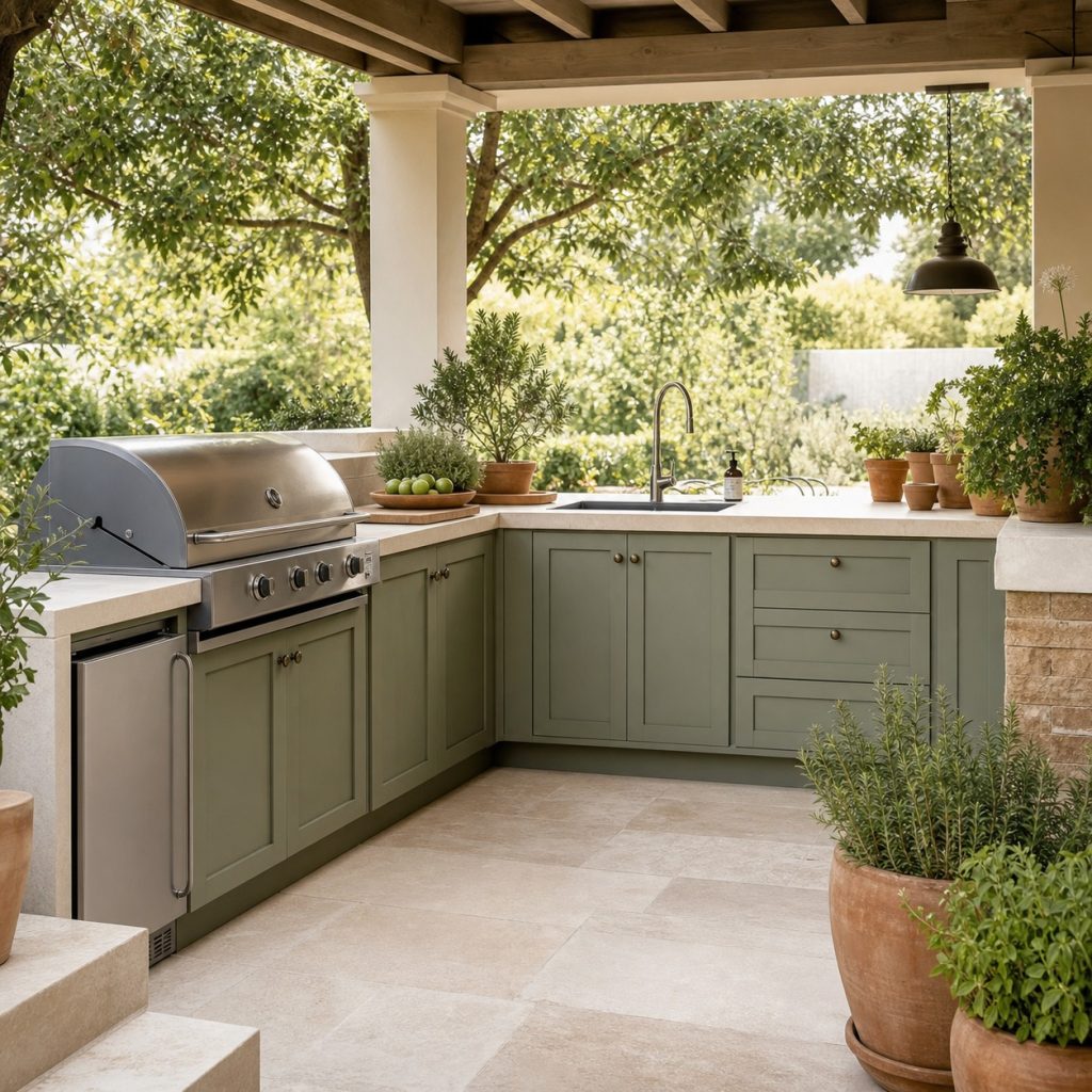
Sage works with herbs, lawns, and mature trees without matching them exactly. Pair it with a warm neutral counter so the work surface remains readable. Test the green beside the house exterior, because surrounding foliage changes its apparent undertone.
Deep Navy and Pale Stone
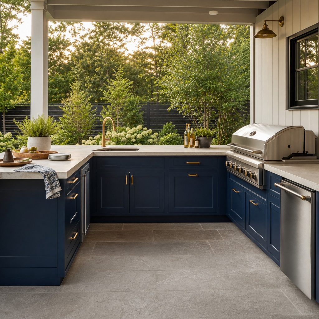
Navy gives definition while feeling softer than black in bright light. Use corrosion-resistant hardware suited to the exposure rather than choosing metal only by color. Keep warm accents limited so appliances and utilities remain visually organized.
Terracotta, Plaster, and Olive
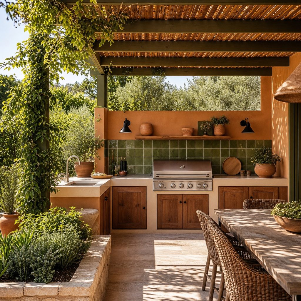
Terracotta connects naturally to brick, clay tile, and warm stone. Use it as a controlled cabinet, tile, or dining accent rather than coating every surface. Olive or dark bronze details add contrast without introducing another strong hue.
Sand, Soft White, and Sea-Glass Green
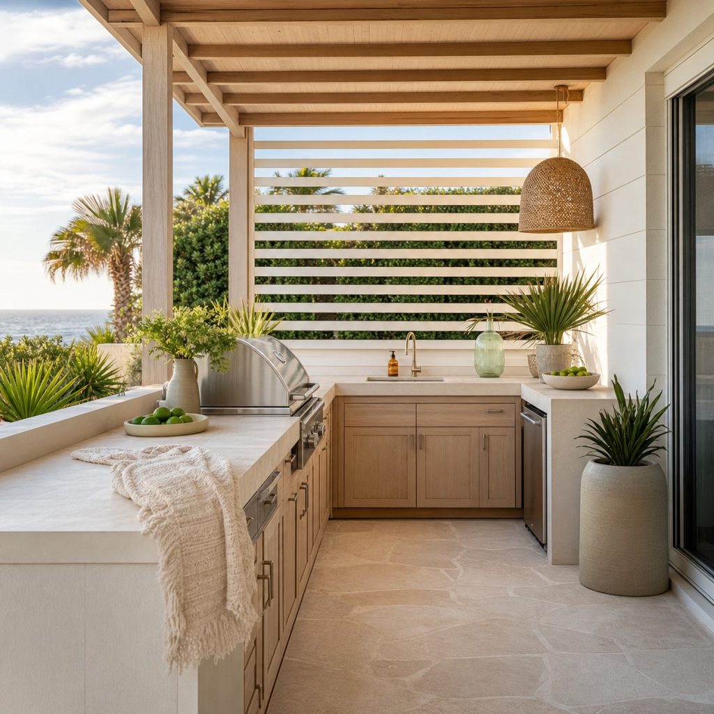
A coastal palette can come from sand, shells, weathered wood, and vegetation without obvious nautical props. Light surfaces may show grill residue, while pale metal can glare. Use a muted green or blue only as a small cabinet or accessory accent.
Black, Off-White, and Garden Green

Black and off-white create a crisp architectural frame for planting. Prevent the scheme from feeling stark by using warm wood or stone at the dining edge. Verify that dark cabinets, counters, and handles remain comfortable in the site’s sun exposure.
Layered Earth Tones
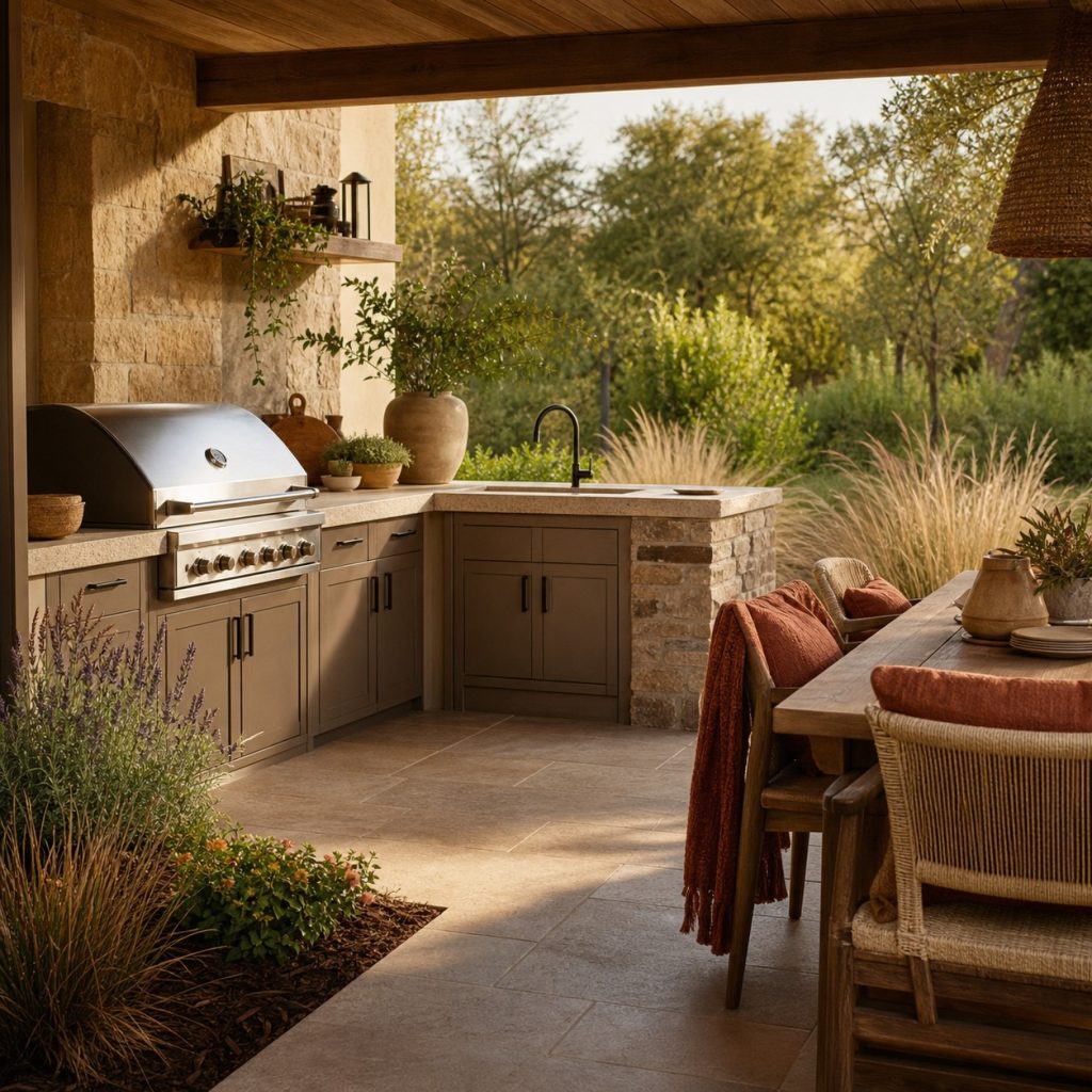
Taupe, brown-gray stone, and rust accents create a forgiving palette for dusty or wooded settings. Match undertones carefully so the materials look related rather than muddy. Let textiles provide the strongest color because they are easier to change.
Planning checklist
- Begin with fixed house, paving, roof, appliance, and landscape colors.
- Test large exterior samples in sun, shade, wet conditions, and evening light.
- Limit the palette to a base neutral, cabinet color, and controlled accent.
- Verify UV, temperature, corrosion, cleaning, and touch-up performance.
- Keep heat safety, ventilation, and service access independent of color choices.
These ideas are general planning guidance. Verify appliance clearances, ventilation, weather and climate exposure, drainage, structural loads, fuel, plumbing and electrical work, permits, and local fire, pool, coastal, deck, and building requirements with manufacturers and qualified local professionals.
Frequently asked questions
What color is best for an outdoor kitchen?
There is no universal best. Coordinate with permanent site materials and choose exterior-rated finishes that perform in the local exposure.
Do dark outdoor cabinets get hot?
They can absorb more solar heat. Test the actual finish and location, especially on doors, handles, and counters touched in full sun.
Should an outdoor kitchen match the house?
It should relate through undertone, material, or architecture, but it does not need to copy every house color exactly.