Project planning guide
Before you build
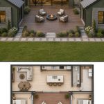
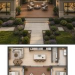
Use the reference image and planning notes as a starting point. Confirm dimensions, loads, materials, local codes, and site conditions before purchasing or cutting.
- Tiny House Plans
- 1 reference image
- Print-friendly guide
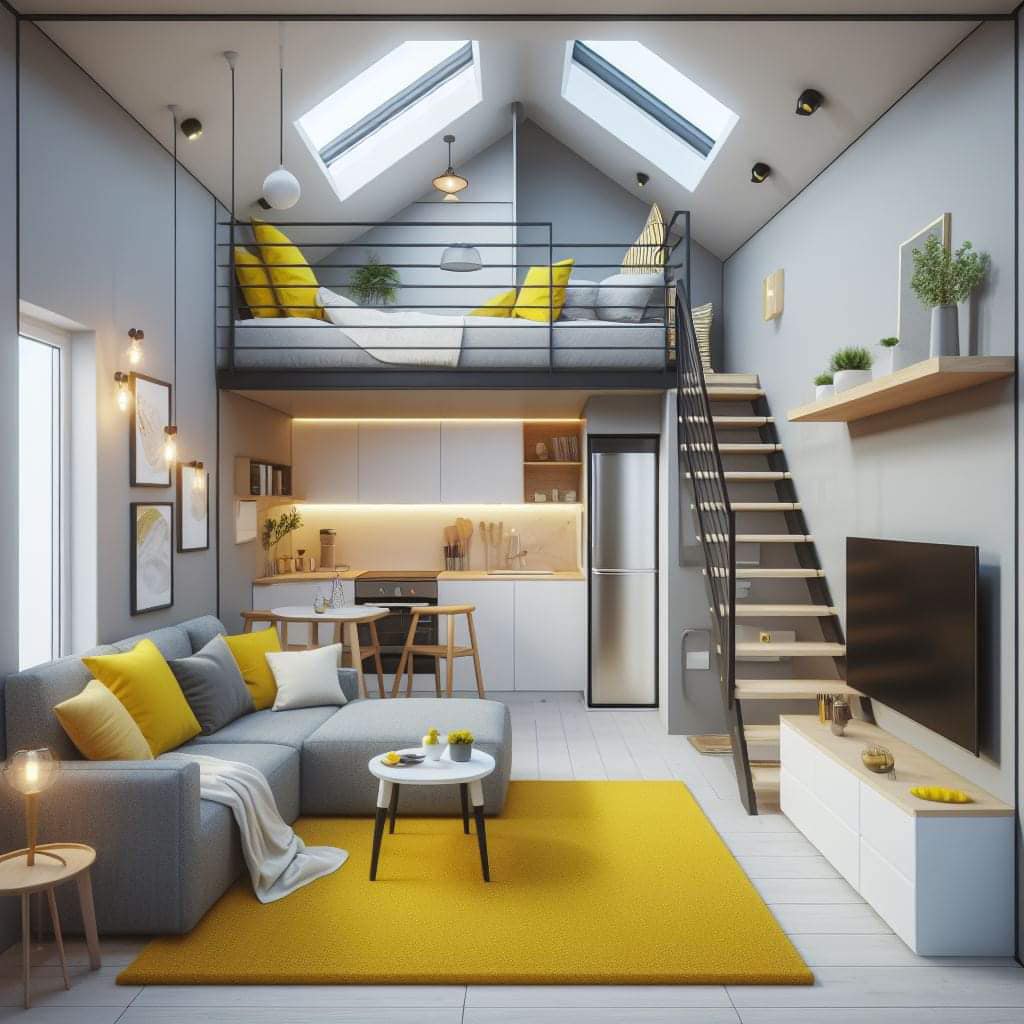
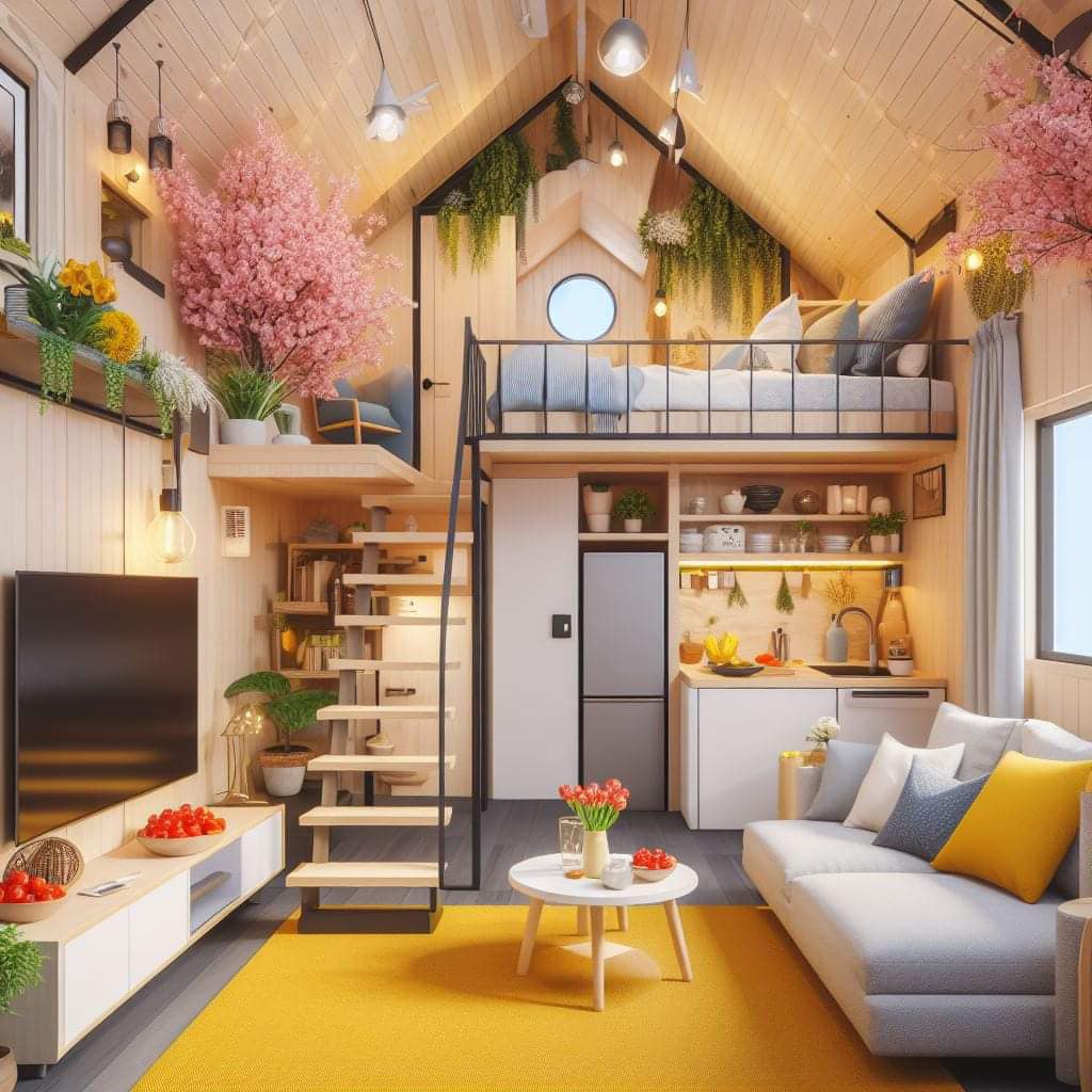
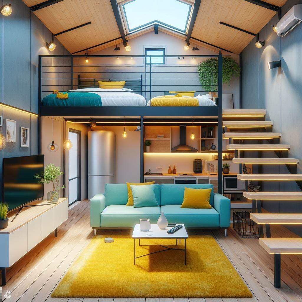
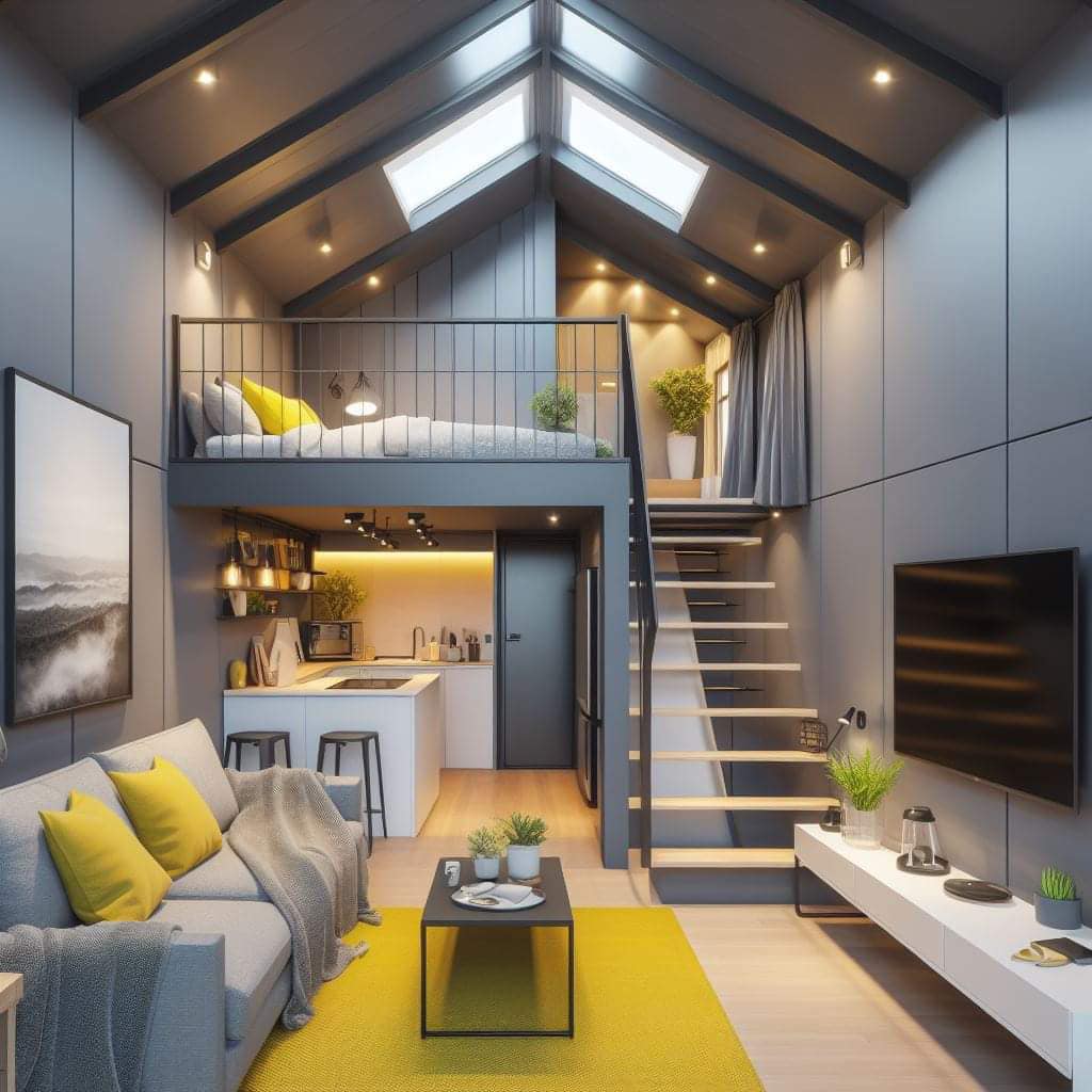
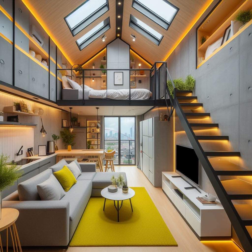
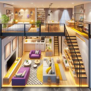
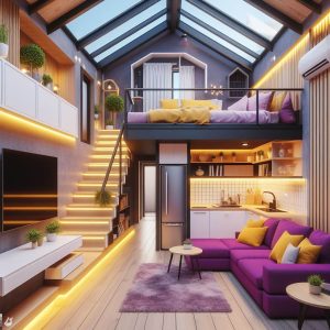
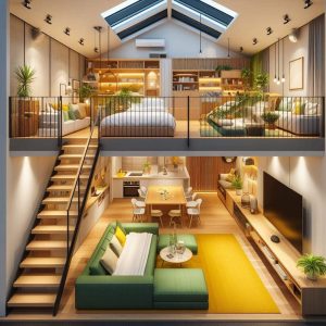
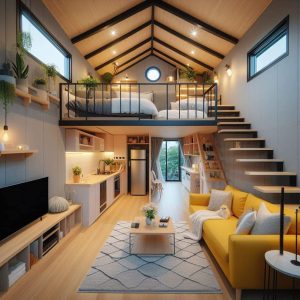
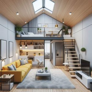
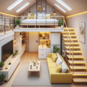
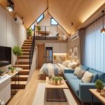
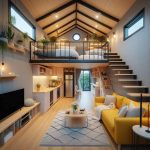
Color in a tiny house affects more than style: it changes perceived depth, glare, daylight distribution, maintenance visibility, and whether adjacent zones feel connected. A restrained base with deliberately repeated accents usually performs better than a different theme in every corner.
Build a palette from fixed materials
Begin with flooring, cabinet fronts, counters, window frames, and exposed structure because those elements are expensive to replace. Identify their undertones in the actual room. Select wall and textile colors that relate to those fixed finishes rather than choosing an isolated paint chip under store lighting.
Use contrast to clarify depth and edges
A slightly darker end wall can visually shorten a narrow room, while a continuous light ceiling can connect living and loft zones. Guards, stair nosings, and level changes need enough visual contrast to remain legible. Do not camouflage edges that people must see clearly, especially in low nighttime light.
Control reflectance and glare
Very bright white can spread daylight but also reflect glare from windows, screens, and glossy counters. Matte or low-sheen finishes on broad walls soften reflections; washable higher-sheen finishes may suit selected wet or high-touch zones. Test the interaction with task lighting rather than assuming lighter is always brighter.
Put saturated color on adaptable layers
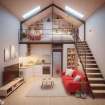
Cushions, curtains, art, a removable backsplash panel, or one cabinet bank can carry strong color without fragmenting the entire interior. Repeat the accent in two or three separated locations so it feels intentional. Avoid placing every warm tone together at one end, which can make the opposite end feel visually detached.
Compare the main approaches
| Approach | Useful when | Verify before choosing |
|---|---|---|
| Light neutral envelope | Sharing daylight across connected zones | Glare, dirt visibility, and sufficient edge contrast |
| Warm wood plus pale walls | Texture and warmth without many colors | Wood undertones, UV change, and finish emissions |
| One saturated accent zone | Defining entry, kitchen, or built-in | Balance, future flexibility, and nighttime appearance |
Test the idea at full scale
Paint or cover boards at least poster size and move them among the loft, kitchen, and darkest wall for several days. Photograph them at consistent times, but make the final decision in person because cameras automatically alter exposure and white balance.
Planning checklist
- Start with fixed flooring, cabinets, counters, and frames.
- Test large samples in multiple lighting conditions.
- Maintain visible contrast at stairs and level changes.
- Use appropriate sheen for glare and cleaning.
- Repeat accents selectively across the connected interior.
Frequently asked questions
Must every tiny house be white inside?
No. Light finishes can distribute daylight, but coordinated medium tones and wood can feel equally spacious when contrast and lighting are planned well.
Can a dark ceiling work?
It can visually lower and define a zone, but test it carefully in low areas because it may reduce reflected light and emphasize limited headroom.
How many colors should be used?
There is no fixed number. A practical starting point is one broad base, one supporting material tone, and one or two repeated accents.
This article provides planning context and conceptual imagery, not measured drawings, engineering, code approval, or a project-specific construction plan. Verify dimensions, structure, products, utilities, permits, and local requirements with qualified professionals before building.